Migrating to v6
This guide explains how and why to migrate from Material UI v5 to v6.
Start using the alpha release
In the package.json file, change the package version from latest to next.
-"@mui/material": "latest",
+"@mui/material": "next",
Using next ensures your project always uses the latest v6 alpha release.
Alternatively, you can also target and fix it to a specific version, for example, 6.0.0-alpha.0.
Supported browsers
The targets of the default bundle have changed in v6.
The exact versions will be pinned on release from the browserslist query "> 0.5%, last 2 versions, Firefox ESR, not dead, safari >= 15.4, iOS >= 15.4".
The stable bundle supports the following minimum versions:
- Chrome 109 (up from 90)
- Edge 121 (up from 91)
- Firefox 115 (up from 78)
- Safari 15.4 in both macOS and iOS (up from 14 in macOS and 12.5 in iOS)
- and more (see .browserslistrc (
stableentry))
Removed support for IE 11
Support for IE 11 is completely removed, by dropping the legacy bundle and all IE 11 related code. This allows us to decrease bundle size and keep the scope manageable. If you need to support IE 11, you can use Material UI v5's legacy bundle, but it won't get updates or bug fixes.
Breaking changes
Since v6 is a new major release, it contains some changes that affect the public API. The steps you need to take to migrate from Material UI v5 to v6 are described below.
UMD bundle was removed
To align with React 19's removal of UMD builds, Material UI has also removed its UMD bundle.
This results in a reduction of the @mui/material package size by 2.5MB or 25% of the total package size.
Instead, using ESM-based CDNs such as esm.sh is recommended. For alternative installation methods, refer to the CDN documentation.
Chip
The Chip component's behavior has been updated to match the standard behavior of other components like buttons. Previously, the Chip component lost focus when the escape button was pressed, which differed from how other button-like components work. This issue has been resolved, and the chip component retains focus as expected.
You can provide a custom onKeyUp handler to implement the previous behavior.
import * as React from 'react';
import Chip from '@mui/material/Chip';

export default function ChipExample() {
  const chipRef = React.useRef(null);
  const keyUpHandler = (event) => {
    if (event.key === 'Escape') {
      chipRef.current!.blur();
    }
  };
  return (
    <Chip
      label="Chip Outlined"
      variant="outlined"
      ref={chipRef}
      onKeyUp={keyUpHandler}
    />
  );
}
Grid v2 (Unstable_Grid)
The spacing mechanism was reworked to use the gap CSS property.
This maps better with current layout practices and removes the need for using React Context.
It brings some breaking changes described in the following sections.
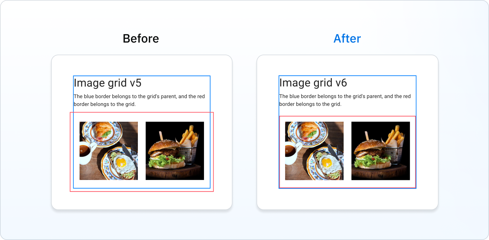
The Grid is contained inside parent's padding
Previously, the Grid overflowed its parent. In v6, this is fixed:

This removes the need for the disableEqualOverflow prop, so you can remove it:
 <Grid
-  disableEqualOverflow
 />
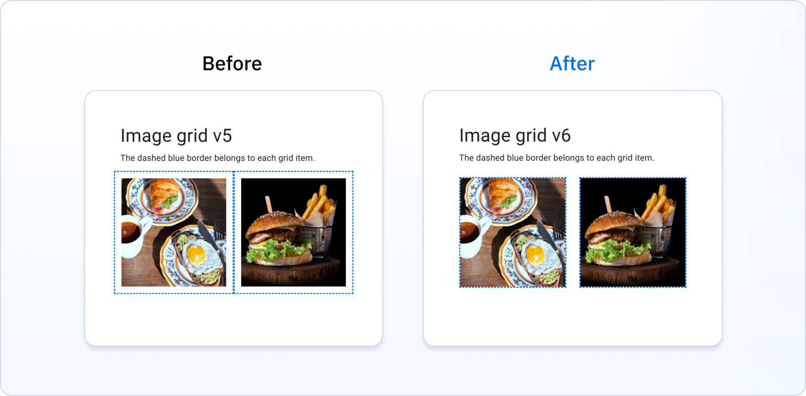
Spacing is no longer considered inside the Grid item's box
Previously, the Grid items included spacing in it's box. In v6, this is fixed:

LoadingButton
Contents wrapped in a
The children passed to the LoadingButton component is now wrapped in a <span> tag to avoid issues when using tools to translate websites.
useMediaQuery
Removed types
The following deprecated types were removed:
MuiMediaQueryList: useMediaQueryList(from lib.dom.d.ts) instead.MuiMediaQueryListEvent: useMediaQueryListEvent(from lib.dom.d.ts) instead.MuiMediaQueryListListener: use(event: MediaQueryListEvent) => voidinstead.